Complementary colours can bring an added level of interest to your images.
Colour Theory And Keeping It Simple
Complementary colours are the most fundamental and simplest of the colour theories to use in photography. They are colours that are opposite one another on the colour wheel. Easy to remember and fairly easy to find just about everywhere you look in nature and in the man-made world.
Think about the colours you see in nature. Red flowers, green leaves. Purple flowers, yellow bees. Orange leaves, blue skies. How about sunsets with their own oranges and blues, or orange sunrises over blue waters. Take a walk out to your vegetable garden, plenty of complementary colours there as well.
As for man-made options, take a look at many of the brands you see on a daily basis. What about signage and advertising? Companies use this tried and true colour theory because it’s easily recognizable and makes images grab their viewers’ attention

Why Complementary Works
Colours that are opposite one another on the colour wheel create a high contrast between the subject and the background. They are vibrant and dynamic which creates interest and a place for the eye to focus in an image. This contrast can also create drama and visual depth to your images. Pay attention and notice how colours work with each other to become more aware of how they affect your image.

A fun way to check the colours in your own images is to upload them to color.adobe.com/create. As always, you can get inspiration from Pinterest by searching for Complementary Colours. You’ll find all sorts of examples in photography, advertising and even home decorating. Check out Brent’s Complementary Colours board.
Practice
Keep it simple. While you are out looking for images to create, look for only two colours that work together. Keep the overall composition simple to focus on the colours. Think about what you learned in the last Issue about Less is More. Decide which colour is dominant and when you’re post-processing maybe reduce saturation/intensity of the other colour to help your main colour character stand out. The composition is key, remember your basic compositional rules.
Photo BootCamp Magazine
On the following pages, see what our BootCamp members have created with complementary colours!
And be sure to check out how you can join BootCamp at the end of the magazine!
(Larger file for desktop or iPad).
Alternatively if you have a slower connection you can view this magazine Here on ISSUU.
Below is a small sample of what’s in this magazine…

Join The Fastest, ‘Funnest’ Way To Improve Your Photography!

Photo BootCamp Academy is an online community where busy photographers gather to take their photography to new levels of enjoyment and progress.
- Discover exciting new skills
- Rekindle your passion for taking photos
- Improve fast with helpful feedback
- Experience enjoyment and progress
Inside BootCamp Magazine
Featured Artist
Let’s take a look at this month’s magazine. Here’s our featured artist of the month, Christopher Goff, from USA.
For his featured image, he said “First do ‘red & green’ then ‘purple & yellow’ then ‘blue & orange’”. With that in the back of mind this particular morning started in the closet innocently enough – looking for a shirt to wear – and found an orange shirt near a blue one – ultimately leading to this image. This is a “steppingstone photo” as Kit have rarely explored artificial lighting/studio techniques or “staged” shots this much. Consequently, for this image no equipment like special lights, diffusers, reflectors, flashes, etc. was used but just a couple of lamps.

Comment: Kerrie Clarke – “Great image, Kit. I really prefer the whites as “whites” as in this first image. I love that sense of chaos thrown into such an “ordered” scene. Love it, well done!
Ps…do you REALLY have that many white shirts?? :))”
Cover Image
This month’s featured magazine cover image is from Martin Gould from the United Kingdom. He had been out all day in Western Rajasthan, India and not got any good shots, but he did have a great time. On returning to their bus, his wife nudged him. He looked up and out of the open window, saw the lady behind the wall, their eyes met, he took two shots, the veil moved across her face and she was gone! in this, he feels he captures the quintessential colours of Rajasthan and is his favourite image of all time. On the colour wheel the orange and blue are diametrically opposite. He did not feel that he will ever take a better travel shot.
Comment: Sig Rannem – “Great capture Martin! Yes, this reminds me of the famous National Geographic picture from Afghanistan. The head and arm are tack sharp and the blurry background is perfect. The colours are dead on too. Great job!”

Active Members
Let’s have a look at some colourful images from our active members and be inspired with what they have created.
Let’s start with Kathy Potter from the USA. She was trying to use green and red for complementary colours. What she did for this shot was to set a very slow shutter speed so she could move the camera as she pressed the shutter button and create movement in her photo. This shot was of a vase with tulips! Kathy actually was happy with the result and according to the colour wheel, they are complementary colours.
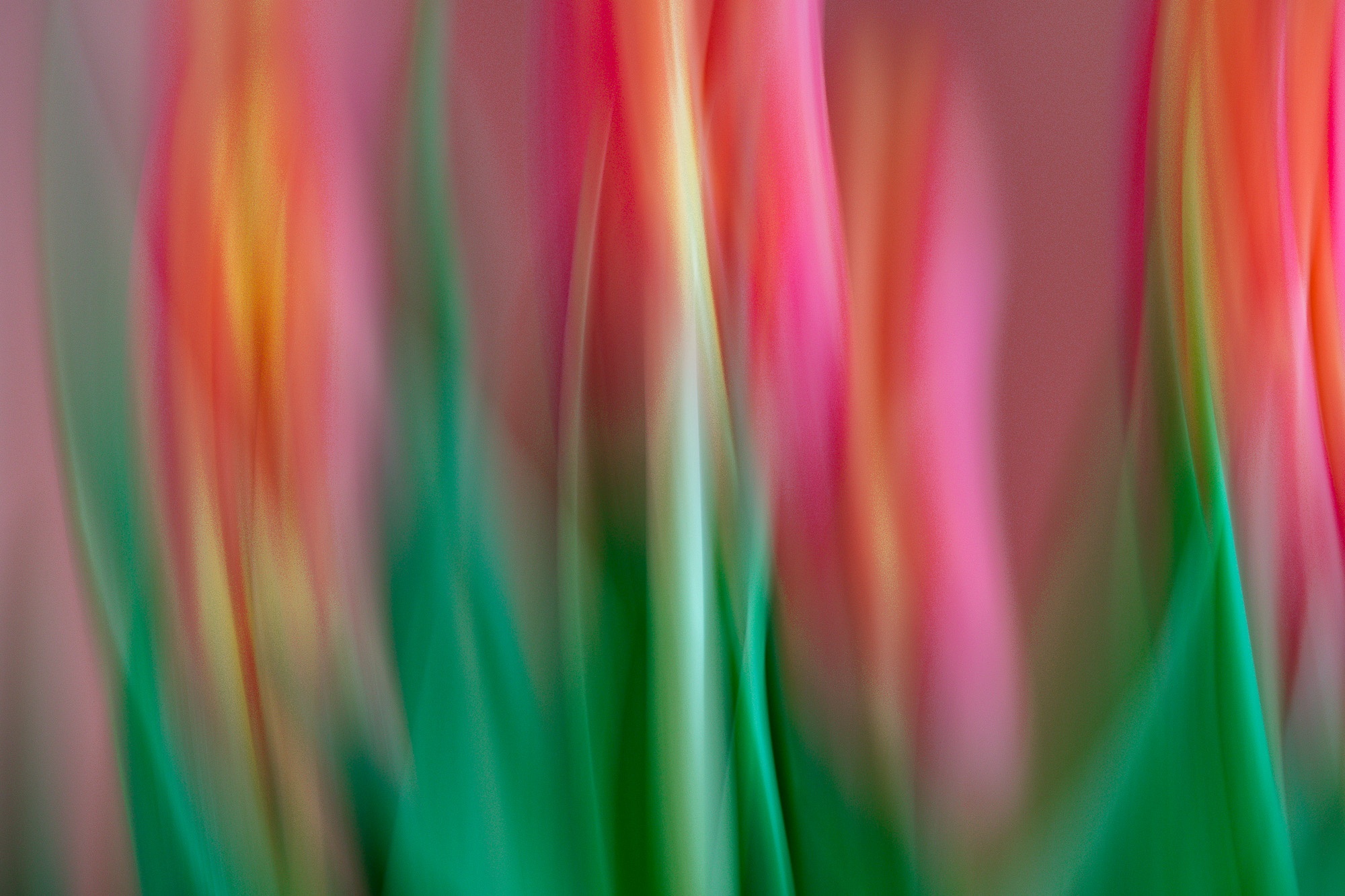
Comment: Nick Ellis – “Cool photo! I really like the colours and the blending of them great! I looked at this and thought ‘one of “Rerro’s”. Now you’ve reached Master status!”
Then we have Denis O’Byrne from Ireland. Last evening a nice sunset nearly happened but then nearly never won the race. Denis was trying to capture the sun as it hit the back of a cloud passing over against the blue empty space behind it.
Comment: Peter Dwight – “Wow Denis, rich colours in that cloud. I thought it was smoke when I first looked. Good proportions of colour, well done.”

Next we have Judy Ward from Canada. While experimenting for the water challenge, Judy took a series of shots with this seed head using several different coloured backgrounds. She tested this against the colour wheel and it meets the challenge. ISO is a bit high as she couldn’t use a tripod due to the position of the natural light when capturing this image, and took the photo handheld.

Comment: Brent Mail – “OMG Judy, another stunning capture. The water droplet point of interest, the leading lines from all directions and then that golden colour against the blue background. Wow! Love how the water magnifies the centre of the seed head. Brilliant!”
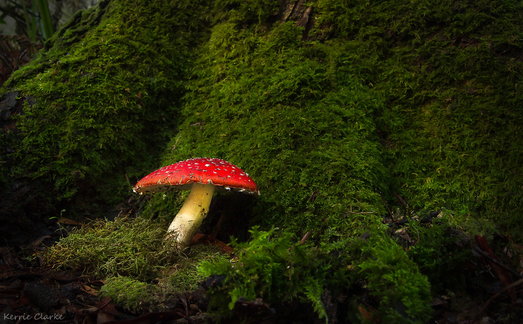
Next we have Kerrie Clarke from Australia. She shot this on the first day of this challenge while walking in the forest near her house. It was wet and muddy, and there were plenty of leeches! Amanita.
Comment: Christopher Goff – “Kerrie. Makes me feel like I am in Middle Earth. I imagine the mushroom as an awning – shading and hiding and inviting me into an unseen door. Nice really sharp focus in the details pulls my eye around afterwards.”
And last but not the least is from John Donnelly from Australia. For this challenge, John have chosen “Yellow on Purple”. Lemons on a purple plate.
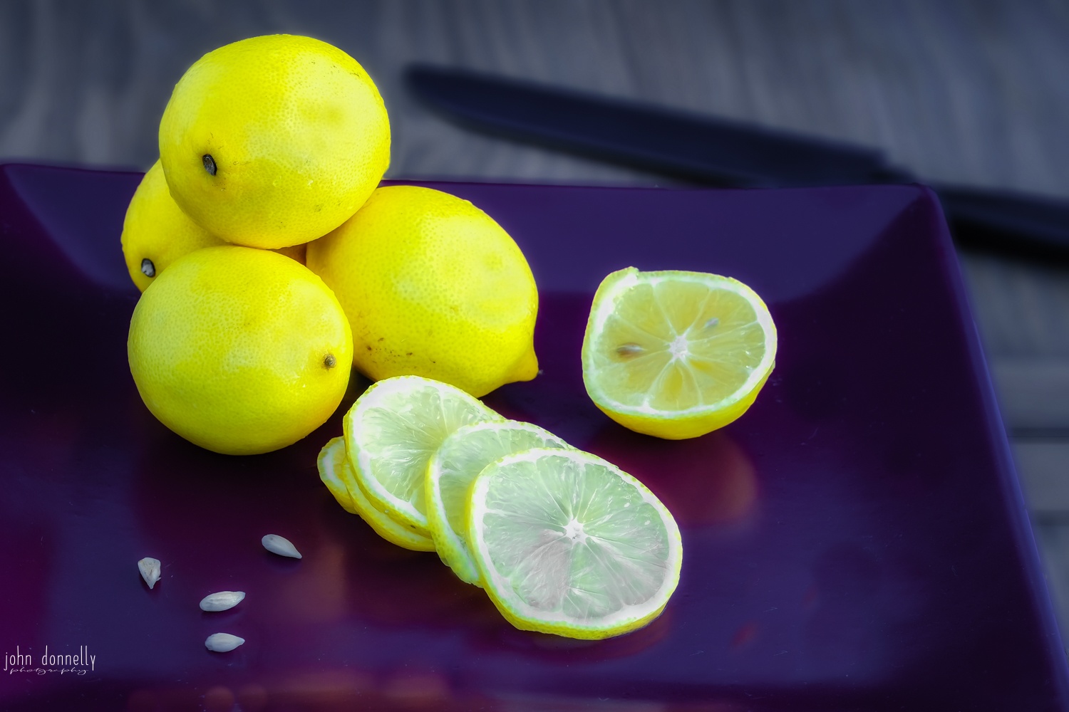
Comment: Gina Skinner – “John – I really like this! It’s fresh and vibrant 🙂 You’ve certainly accomplished the challenge with this image. The shape of the plate and the arrangement of the fruit is well composed, the lemon seeds are the finishing touch. Makes my mouth pucker just looking at it ….. lol :)”
These are the BEST colourful images we have ever seen. Wouldn’t you agree? Colourful images are pleasing to the eyes and will always make our day brighter and just by seeing these awesome images from our members it will inspire us to create one of kind photographs. Now be a part of this awesome family and check out the complete BootCamp Magazine and see for yourself!
Summary
- Using complementary colours can bring an added level of interest to your images and make the subjects stand out more.
- They create a natural contrast that our brains find interesting. You can use them within your compositions or as a compositional tool on their own to raise the level of wow in your images.
- Experiment to see what works and how certain colours look and work or don’t work together within your image. Have fun with it.
Related Articles
Did you enjoy this article? Check out these related articles, too:
- Telling a Story Through An Image Using Patterns
Using patterns to draw your viewer’s attention to you artistic images. - Photography, Meet Simplicity
Practice minimalism to develop your artistic eye. - Leading Viewers On A Journey Through An Image!
A creative way to use leading lines to make your images more exciting and meaningful.
Do This Now
Dive into BootCamp and come join the fun – Click Here to join BootCamp today!
Share your thoughts with me in the comments section below. I love hearing what you guys come up with!