Learn how to control the visual balance in your images.
What is visual balance in photography?
Visual balance is one of the rules of composition. It is created when the objects in your frame are evenly distributed across the scene using the visual weight, space and colour to create a balance in the image.
Your scene is in balance when different parts of the image draw the viewers attention equally.
Why it’s important to use visual balance in your photographs
Using visual balance in your photos helps create peace, unity and order to the viewer’s eye and mind. It creates an equilibrium that makes your image feel complete and harmonious.
If there is no balance in your image it creates tension and can feel uncomfortable.
What types of visual balance are there in photography?
There are several ways to place objects that will create visual balance. You can place items on the left and right of your frame or you can place them in the top and bottom of the frame to create balance. That’s one way. You can arrange them diagonally across from each other as well. This is symmetrical balance.

Asymmetrical balance is more subtle. By balancing items that have more visual weight with those that have less visual weight, you create a different sense of balance.
What do we mean by visual weight? Larger objects carry a heavier visual weight than smaller items. The objects that draw your eye immediately tend to have a heavier visual weight. Things like dark objects, bold colors, textures, patterns, movement all pull your eye more strongly than the opposite of those. You can use the heavy and light together if you place them carefully in your frame.
How to create visual balance in your photographs
Start with what you have. It can be ingredients in your kitchen, tools in your garage or your child’s toys. Choose several items that you feel work together and start arranging them one item at a time.
- Place the first item and use the next item to balance the first.
- Then continue to add objects all while paying close attention to the placement and feel of the arrangement.
- Step back and look to see if it feels heavy to one side or if it feels balanced.
Keep playing. If it something feels off to you, rearrange what you have until it feels balanced. Try both vertical and horizontal orientations.
Photograph from above or other angles. Be sure to check your depth of field and lighting. If you want everything in focus close down your aperture and use a wide-angle lens.
Get creative with colors and shapes. Start simple and add elements. And of course, have fun with it. If you need some inspiration check out the Pinterest board for examples.
Photo BootCamp Magazine
Let’s see how our BootCamp members did with creating visual balance in their images for this month’s challenge.
And be sure to check out how you can join BootCamp at the end of the magazine!
(Larger file for desktop or iPad).
Alternatively if you have a slower connection you can view this magazine Here on ISSUU.
Below is a small sample of what’s in this magazine…

Join The Fastest, ‘Funnest’ Way To Improve Your Photography!

Photo BootCamp Academy is an online community where busy photographers gather to take their photography to new levels of enjoyment and progress.
- Discover exciting new skills
- Rekindle your passion for taking photos
- Improve fast with helpful feedback
- Experience enjoyment and progress
Inside BootCamp Magazine
Featured Artist
Let’s take a look at this month’s magazine. Here’s our featured artist of the month, Keri Down, from Australia.
For her featured image, she said this photo is more about her artwork than the photo. This was actually a difficult task for her. Keri spent more time carving veggies for her masterpiece than actually photographing them. however, she did herself.
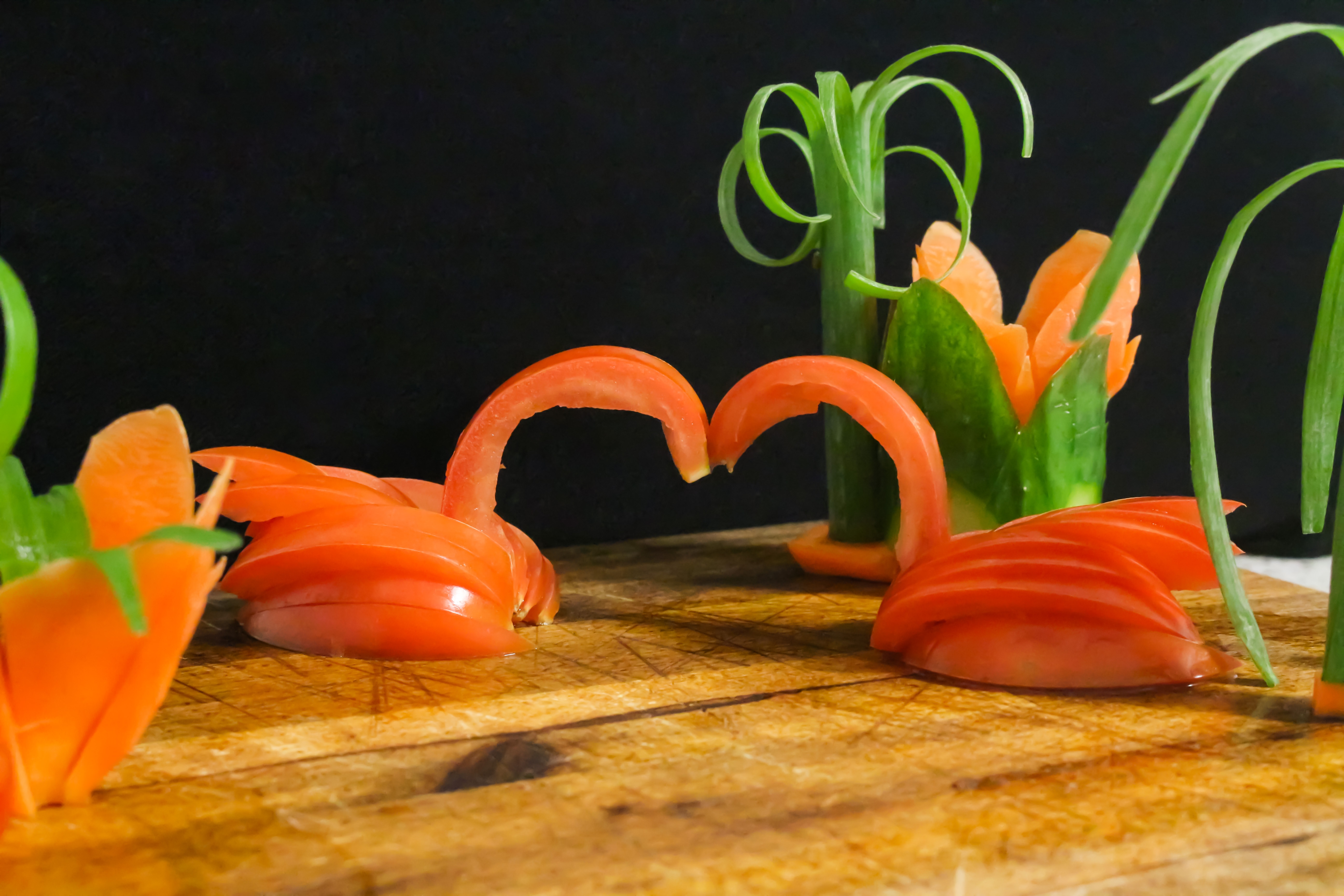
Comment: Brent Mail – “Super creative Keri – reminds me of what my parents used to say to me when I was younger “Stop playing with your food”. Love the two swans “necking”. Would love to know how the final piece of art came out. :)”
Cover Image
This month’s featured magazine cover image was taken by Sheree Ebanks from Cayman Islands. The idea took her a while to come up with and then set up. She tried a number of places around the house and settled here as she wanted natural light from the window. She utilized the tripod as demonstrated in Brent’s video, which was a new trick — thanks to Brent! Keri did some very minor edits in LR, but could not get rid of the shadow top right. She tried the graduated filter, but could not figure out how to use that! Keri did use the radial filter on the limes to lighten the surface closest to the light and cleaned some excess baking soda off the table. The table Keri used is actually a tall table in her dining room.
Comment: Erez Shilat – “Well planned, creative and well balanced image. Beautiful colors. Very nice image Sheree. It is difficult to remove shadows, especially if the shadow reduced the original details. Personally, I don’t find it distracting and don’t think that you should do anything about it. You can try to use PS to copy a near region (using lasso tool) and then warp it to fit, or a much easier solution will be to add shadow to the bottom left corner to balance the top-right shadow as a vignetting.”

Active Members
Let’s take a peek at some of our BootCamp members’ visual balance images.
We’ll start with Peter Dwight from the Australia. This is his interpretation of visual balance using the tools of his trade as a mechanic.

Comment: Sheree Ebanks – “Peter, This is super creative and I love how you took your everyday tools and made them into art. I love both versions, but I will say I prefer the B&W—I tend to like B&W in any event. Well done!”
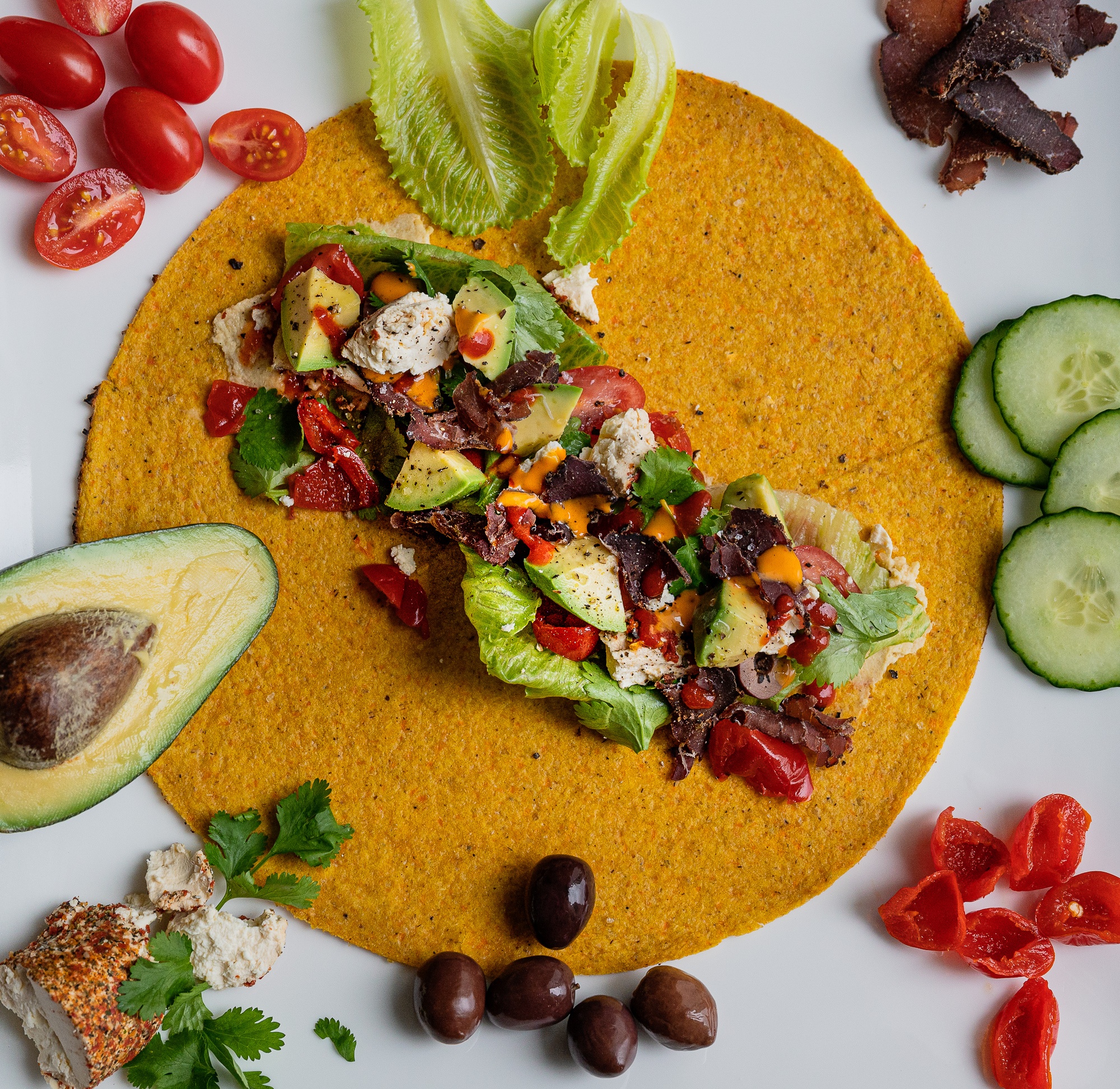
Next, we have Laura Griffiths from South Africa. She’s taken to the high colour of Brent’s food video with a lunch dish they often have. A wrap, some salad ingredients, cold chicken, fish or meat (in this case biltong), some peppadew chutney mixed with hummus to line the strip under the ingredients, and some chili sauces (Schiracha or whatever) coriander or rocket and seasoning on top of the chopped salad. Laura added a long narrow radial filter to the food strip opposite the natural window light to lighten that side as she didn’t use a filler light and it was a bit shadowy.
Comment: Gina Skinner – “Yummo, I’m starving! I understand the idea of placing the ingredients used around the tortilla/wrap, for balance. The POI is awesome, everyone will be able to enjoy it because you have sooo graciously shared the main ingredients 🙂 Great first image for this challenge… can’t wait to see your next image, LOL!”
Janette Planck from Australia is next. This is Janette’s first shot for the challenge. She decided to have a play at continuing her learning in Photoshop. This shot was taken a couple of years ago in a forest. She was drawn to the way the cone had fallen and landed in the leaves and it’s proximity to the contrasting leaves. She did very little editing in Photoshop, but played around with a couple of filters, firstly in Topaz Labs 2 and then decided to look at the Nik Colour Efex Pro. A bit of fun before her indoor lighting adventure begins.
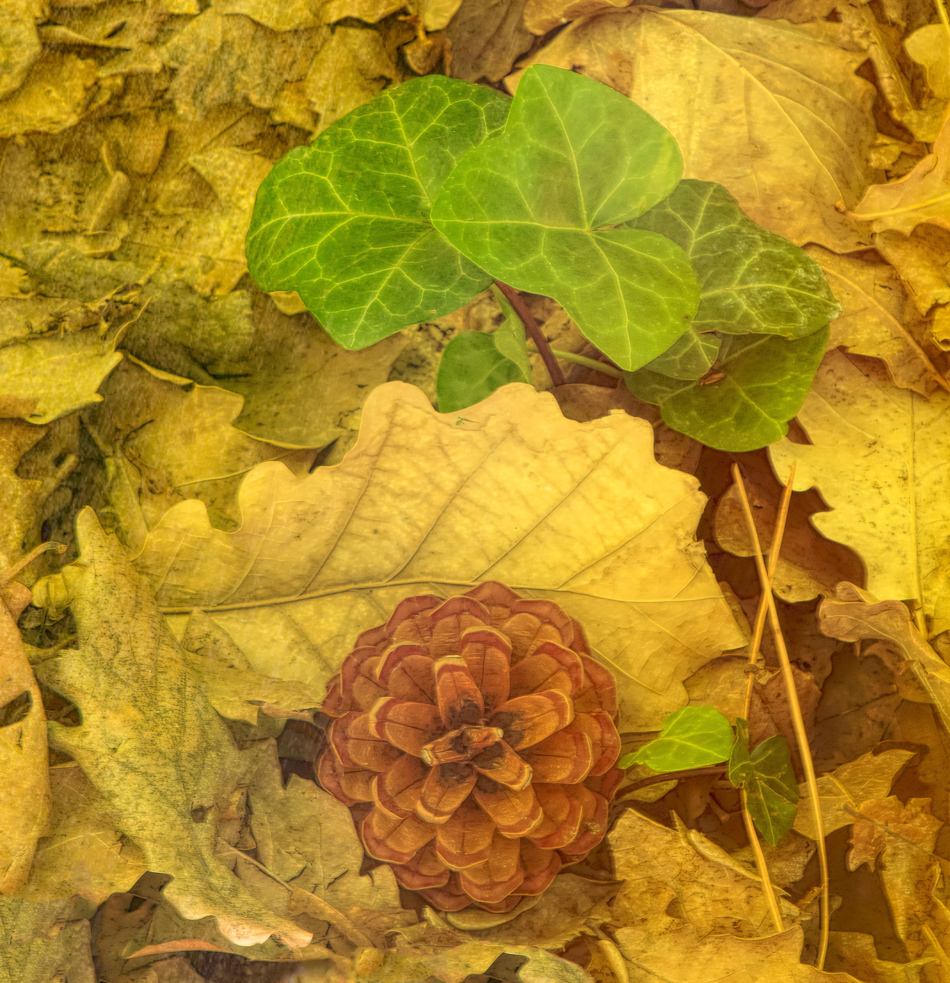
Comment: Peter Brody – “Janette, the pine cone nailed a “perfect landing” in the forest of golden leaves, with a touch of ivy “beaming” through. The judges scored it a 10!!
Then we have Nick Ellis from Australia. He was out in the shed to do some sawdust making and thinking about this month’s challenge. Nick thought most others might go with a cooking theme, so he picked a few items he uses with his other passion!
Comment: Leila Gonzalez Sullivan – “This photo captures my eye in two complementary ways. The mostly vertical arrangement and darker colors contrasts with the horizontal grain of the wood to fill the space in a pleasing way. The mostly monochromatic tones add even more. Well done.”

And last but not least, is this image from Ruth Lopez who lives in the USA. Ruth said that she learned so much about light during this month’s challenge. After several unsatisfying attempts at indoor food shots, she researched online and found quite a few tips on “chiaroscuro”, or light-dark photography. Not only has she always liked this style but it was also easier for her to implement. The lighting is fairly soft in her house, she doesn’t have any indoor lighting gear, and her eclectic dinnerware is more suitable for a ‘rustic’ look. This 3rd submission was a simple setup using chiaroscuro: her husband’s favorite snacks on a cutting board, placed on a chair beside a sliding glass door, and the curtains closed to create a narrow slit of light. The backdrop is just his blue vest over the chair back. It took a bit of time to visually balance the items and get the beam of light to land where she wanted, but it was fun. Fortunately her husband doesn’t mind if his beer isn’t ice cold. The glass needed post processing in PS to remove the most noticeable scratches and reflections, and to add a ‘spot light’ in the liquid to enhance the glow. The rest of the processing was done in LR using radial and graduated filters to reinforce the light.
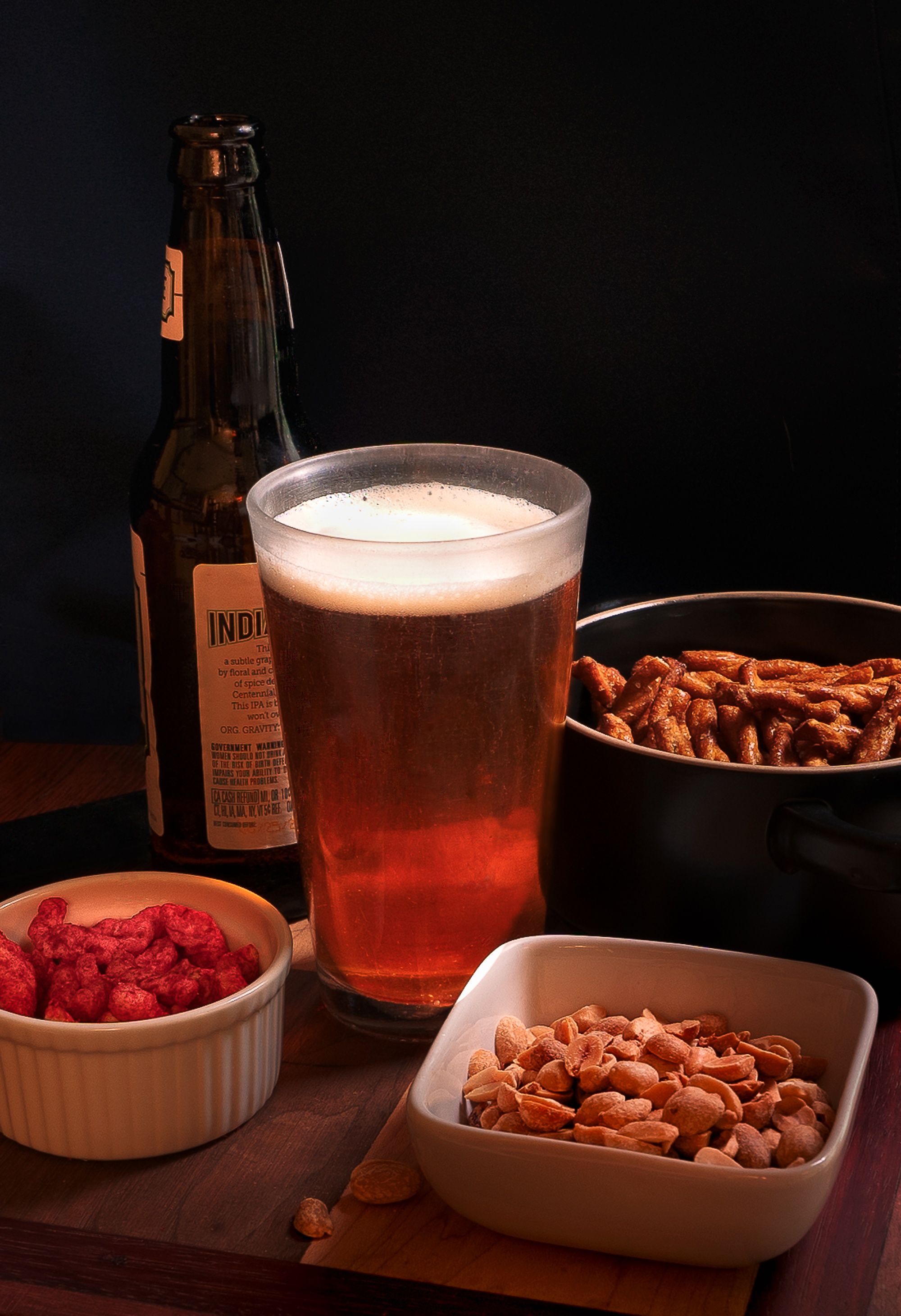
Comment: Erez Shilat – “Love your illumination Ruth, it creates an interesting mood. I really like the result – well done!”
These are some of the awesome images that our members created in response to the visual balance challenge. You can also share your images by joining BootCamp and can count on the community to help and guide you along the way. If you are not yet a member of this awesome family now is the best time to become one. You can check out the complete BootCamp Magazine and see for yourself!
Summary
- Visual Balance in photography creates peace, unity and order in an image.
- There are two types of visual balance: Symmetrical & Asymmetrical
- Remember larger items carry a heavier visual weight than smaller items, same with dark objects, bold colors, textures and patterns.
- To create visual balance arrange and rearrange the items in your scene until it feels balanced
Related Articles
Did you enjoy this article? Check out these related articles, too:
- Telling a Story Through An Image Using Patterns
Using patterns to draw your viewer’s attention to you artistic images. - Photography, Meet Simplicity
Practice minimalism to develop your artistic eye. - Exploring The World From A Bug’s Eye View
Learn how to get the best bug’s eye view images.
Do This Now
Please leave me a comment below – I’d love to know what you think. Brent
Congratulations to our featured artist – Keri Down, from Australia, and cover image by Sheree Ebanks from Cayman Islands. You guys rock! Brent